Sessions Cannabis Extracts
2018
Client
Dab Factory
Color & material
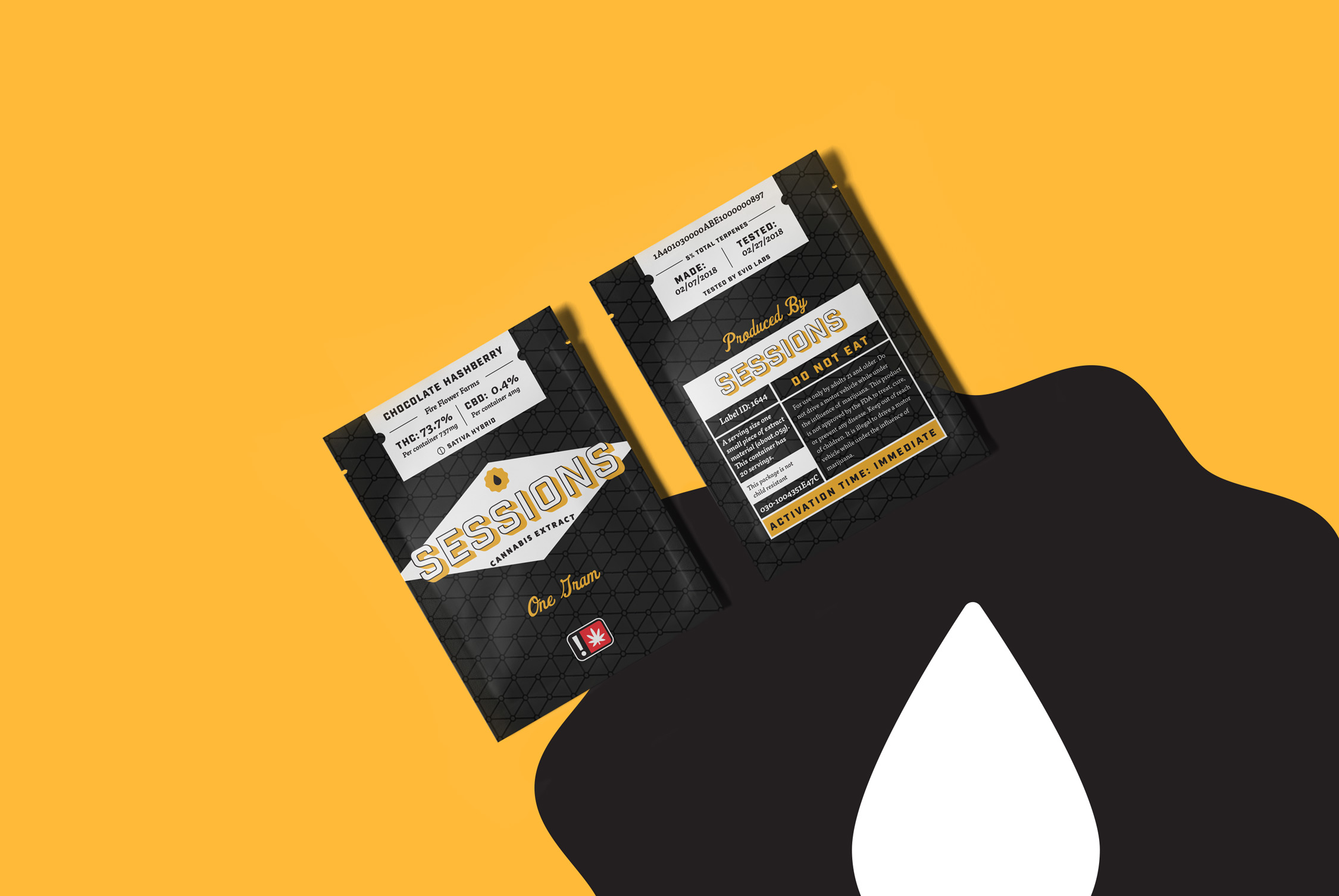
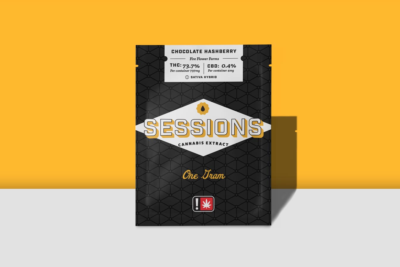
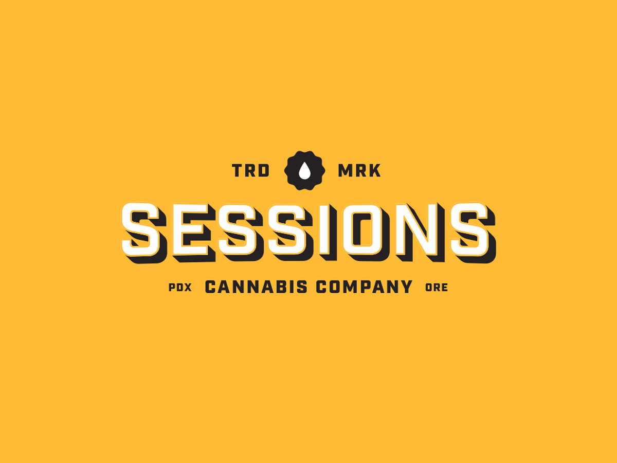
Bright high contrast color to stand out among the crowded bottom shelf of cannabis extracts in Oregon. That accompanied with a geometric pattern to reflect the nature of the production processes help build out a cohesive brand.
Light Orange
#f9be3e
Dark
#161616
White
#2f3530
Driven to stand out and be memorable in the crowd.
- Packaging
- Logo
- Brand Strategy

